
- The most successful 2025 rebrands (Amazon, Walmart) solved a real internal problem, fragmentation, rather than chasing trends for the sake of looking fresh.
- Heritage is a brand asset, not a liability. Cracker Barrel learned this the hard way when it discarded a beloved icon and faced a public backlash that erased $100M in market value in days.
- HBO Max's return proves that a powerful name is worth protecting, and that abandoning brand equity to chase trends is a recoverable mistake, but still an expensive one.
- Every corporate rebrand lesson in this post applies directly to small businesses. The scale is different; the principles are identical.
Every year, a handful of companies make big bets on their brand. They hire agencies, convene strategy meetings, study consumer research, and eventually roll out a new visual identity that will be seen by millions of people. Sometimes it works. Sometimes it backfires spectacularly. Sometimes it quietly does exactly what it was supposed to do and almost nobody notices, which, depending on the goal, can be a sign of success.
2025 was a particularly rich year for brand watchers. Five of the most recognizable companies in the world overhauled how they present themselves to the public, and the range of outcomes tells us something important about what branding can and can't do, and why the decisions behind a logo change matter far more than the logo itself.
Let's go through them one by one.
Amazon: A 20-Year Accumulation of Chaos, Finally Addressed
In April 2025, Amazon debuted its first major brand overhaul in more than two decades. The project, led by global branding agency Koto over 18 months, touched more than 50 sub-brands across 15 global markets: from Prime and Alexa to Amazon Grocery, Amazon Fresh, and Amazon One Medical.
From the outside, the changes look modest: a warmer, deeper "Smile Orange" color standardized across the brand, a redrawn logo with a slightly more emphatic smile, and a custom typeface called Ember Modern replacing the patchwork of fonts that had accumulated across different teams and regions. On the surface, it barely registers as news.
The real story was what had been happening underneath. Over 20 years of explosive, often chaotic growth, Amazon's brand had become, in Koto's own words, "visually fragmented." Different teams across different regions had developed their own logo treatments, color variations, and typographic conventions. Sub-brands like Amazon Echo and Amazon Jobs looked like they belonged to different companies. The Ember typeface, originally designed for Kindle screens, was being mixed with unrelated fonts to compensate for what it couldn't do well. The result was a brand that had lost the ability to speak with one voice.
The rebrand gave Amazon something that even a $2 trillion company didn't have: a single, consistent visual language that works the same way whether it's on a delivery van, a Prime app, or a Formula 1 race car.
The practical output: a unified logo architecture for all 50+ sub-brands built on the new Amazon Logo Sans typeface, a global color system anchored by Smile Orange and Prime's saturated digital blue, and an icon system built from the smile mark and Ember Modern that works across every scale from app icons to warehouse signage.
The lesson: Brand fragmentation is one of the most common and most invisible problems a growing business faces. When you're moving fast, adding services, launching new offerings, updating materials as you go, consistency is the first casualty. Amazon needed 18 months and a world-class agency to fix 20 years of drift. The smaller your business is, the easier and cheaper it is to address this before it compounds.
Walmart: Heritage as Strategy
On January 13, 2025, Walmart unveiled its first brand refresh since 2008, the year the iPhone was a year old and the company still spelled its name with a hyphen. The timing wasn't coincidental. Walmart's e-commerce sales had grown 22% in the previous quarter, and the company was increasingly competing not just as a big-box retailer but as a digital-first omnichannel platform. Its visual identity needed to catch up.
The centerpiece of the refresh was its new wordmark, a custom typeface called Everyday Sans, inspired by the font printed on a trucker hat that founder Sam Walton wore on the cover of his book, Made in America. Walmart's design team had gone into the corporate archives looking for something that could connect heritage to the brand's current vision, and they found it in the founder's closet.
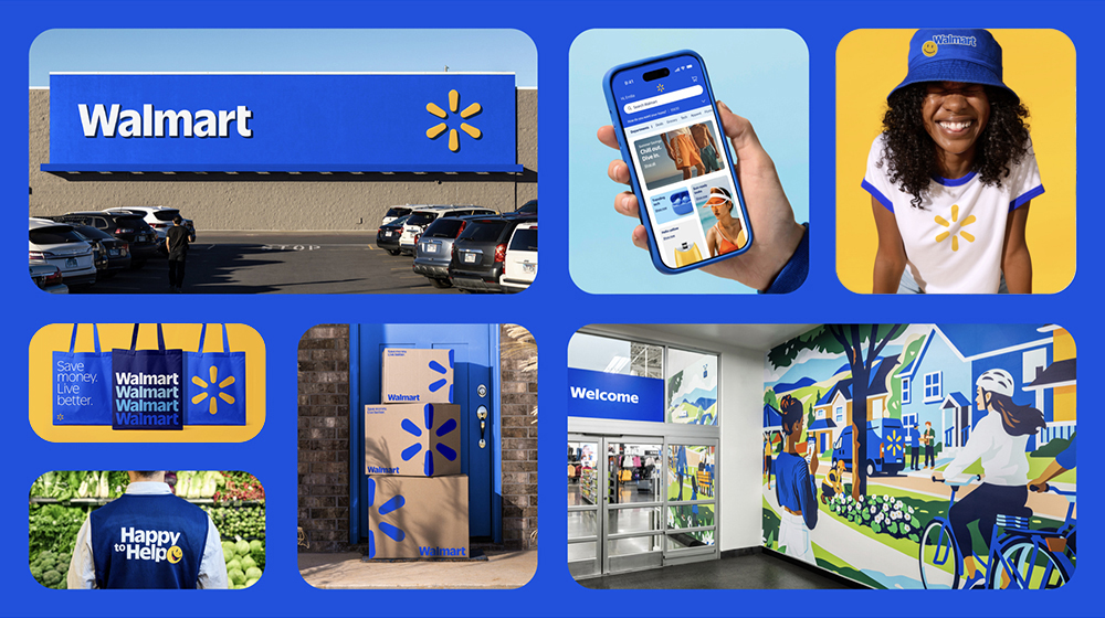
The refresh also updated the brand's "spark" icon, the sunburst symbol that has represented Walmart since 2008, with what the company described as "organic curves that feel approachable and less rigid." The color palette was amplified into what Walmart calls True Blue and Spark Yellow: bolder, more vibrant versions of the existing colors rather than a wholesale color overhaul.
Walmart's vice president of creative was explicit that this was not a revolution. "It's very much an evolution versus a revolution," he said. The brand didn't need to reinvent itself; it needed to modernize what it already was, make it work better across digital surfaces, and give its retail identity the same energy its e-commerce business had been building.
The lesson: Your brand's history is an asset, not an obstacle. The instinct when modernizing is often to start fresh, to leave the past behind and project a new identity. But a business with a genuine story, a recognizable heritage, or a founder with a distinct personality has something most companies spend years trying to manufacture. Excavating and elevating that story is almost always more powerful than replacing it with something generic and contemporary.
Jaguar: The Boldest Bet in Automotive History
In late 2024, Jaguar announced a complete brand reinvention, and by 2025 it had become one of the most analyzed and debated rebrands in recent memory. The British automaker replaced its traditional leaping-cat emblem with a stark, modernist wordmark in an all-caps, serif-less typeface. The new identity dropped virtually every visual cue that had defined the brand for decades: the heritage script, the animal motif, the sense of restrained British luxury.
In its place: clean geometry, a bold pink and yellow visual language in its launch campaign, and messaging that made almost no reference to cars at all. The teaser video, released to considerable online bewilderment, featured models in avant-garde fashion against abstract backdrops. The tagline: "Copy Nothing."
Jaguar's rebrand wasn't cosmetic. It was existential. The company is transitioning to an all-electric lineup and targeting a dramatically different customer: ultra-premium buyers who currently choose Bentley, Lamborghini, or Rolls-Royce over Jaguar. The old identity had no credibility in that space. The new one was designed to create distance from the brand's past and signal that this is a completely different company targeting a completely different buyer.
The rebrand was controversial by design. Jaguar's leadership understood that the existing brand had limited equity in the ultra-luxury EV segment they were targeting. Rather than trying to gradually reposition an identity that carried a decade of declining sales and a reputation for unreliability, they chose to break entirely with their past and build something new from scratch.
Whether it works is a question that won't be answerable until Jaguar's new electric vehicles hit the road. What's not debatable is the clarity of the strategic thinking behind it. This wasn't a confused rebrand. It was a calculated, expensive, deliberate wager that their existing brand was worth less than the cost of building a new one.
The lesson: Rebranding is sometimes less about design and more about repositioning. If your business has genuinely changed, if you're serving a different customer, offering different services, or operating at a different level of quality than when your brand was built, your visual identity should reflect that evolution. A logo that no longer matches the business it represents is a liability, not a legacy.
HBO Max: The Expensive Lesson in Brand Equity
In July 2025, the streaming service that had already been renamed from HBO to HBO Go to HBO Now to HBO Max and then simply "Max" reversed course again, returning to the name HBO Max. The decision was a quiet but significant admission that dropping "HBO" in 2023 had been a mistake.
The logic behind the 2023 "Max" rebrand had seemed sound at the time. Warner Bros. Discovery wanted a single streaming platform that could house content from HBO, Warner Bros., DC, Discovery, CNN, and beyond. The thinking was that "HBO" was too narrowly associated with prestige drama to serve as the umbrella for a broader entertainment platform. "Max" was designed to feel expansive and contemporary: a blank canvas.
What the company underestimated was how much value the HBO name carried. Decades of association with prestige television (The Sopranos, Game of Thrones, Succession, The Wire) had built the HBO brand into something that "Max" simply couldn't replicate. Consumer research and internal data both pointed to the same conclusion: subscribers associated quality with HBO, not with the streaming technology it was delivered through. The platform had stripped out its most powerful asset in the name of flexibility.
By returning to HBO Max, the company didn't just restore a name. It acknowledged something that applies to every business at every scale: brand equity is real, it accumulates slowly, and it can be discarded in a press release.
The lesson: Before you change a business name or visual identity, take an honest inventory of what equity already exists in it. If customers associate your current brand with quality, reliability, or a specific feeling, that association has value. Rebranding should build on existing equity wherever possible, not abandon it for the sake of a cleaner or more modern identity.
Cracker Barrel: What Happens When You Forget Who Your Customer Is
In August 2025, Cracker Barrel rolled out a new logo that replaced its long-standing "Old Timer," the illustration of an elderly man leaning on a barrel, with a clean, minimalist wordmark. The goal was to modernize the brand and reach younger diners. The result was one of the most spectacular brand reversals in recent memory.
The backlash was immediate, intense, and crossed political lines. Loyal customers accused the company of abandoning its identity. Social media generated roughly 351,000 mentions of the rebrand within weeks. Cracker Barrel's stock fell nearly 10%, erasing close to $100 million in market value. Within days of the announcement, the company reversed course, scrapping the new logo and reinstating the original.
For Cracker Barrel's core customer, the Old Timer wasn't just a logo element. It was a promise. It said: we are the same place your grandparents stopped on road trips. We are not going to change on you. Removing it didn't just update a visual. It broke a 50-year-old implicit contract with the brand's most loyal audience. Design experts later noted the new identity was actually well-executed. The problem was never the design. It was the failure to understand what the old one meant.
There's a lesson here that goes beyond branding strategy. Cracker Barrel's redesign wasn't poorly executed from a pure design standpoint. Several respected design critics defended the new identity's craft. What failed was the strategic judgment about whose trust was most at stake. The brand's core customer was deeply attached to the nostalgic, heritage identity. The attempt to attract younger diners came at the direct cost of alienating the people who had been coming every week for decades.
The lesson: Know your customer's relationship with your brand before you change it. A logo is not just a graphic. For many customers, it's a symbol of continuity and trust. Before removing or dramatically changing a brand element that's been in place for years, the question to ask isn't "does this look more modern?" It's: "what does this mean to the people who already love us?"
The Five Lessons That Apply to Your Business
These five companies spent tens of millions of dollars collectively, on research, strategy, design, and rollout, to learn lessons that are available to any business owner who's paying attention. Here's the distilled version:
1. Solve a real problem, not a perceived one
Amazon and Walmart didn't rebrand because they felt like it was time for something new. They identified specific, documentable problems (visual fragmentation for Amazon, digital-physical disconnect for Walmart) and built a solution. The most successful rebrands have a brief that answers "what specifically is broken?" before anyone touches a design tool.
2. Heritage is equity. Treat it accordingly
Both Walmart and HBO Max (in its return) demonstrated that what's already embedded in your brand has real, measurable value. Walmart leaned into its founder's trucker hat. HBO Max acknowledged that decades of prestige television belong to those three letters. Don't discard what took years to build just because it feels old.
3. Understand why you're changing before you change
Jaguar's rebrand was controversial but strategically coherent. They knew exactly why they were making every decision, even the most jarring ones. Cracker Barrel's rebrand had no such clarity. Know your reason before you pick up a design brief.
4. Your existing customers always vote first
Cracker Barrel tried to attract younger customers and lost its core audience in the process. Before pursuing a new market through brand changes, be honest about the cost to the relationships you already have.
5. Consistency is the compound interest of branding
The throughline across every successful rebrand in 2025 is the word "system." Amazon built a brand system. Walmart rolled out a consistent identity across digital and physical. HBO Max re-unified its name and reputation. A single good logo is not a brand. A consistent system (applied the same way, every time, everywhere) is.
The biggest difference between a $2 trillion company's brand problems and a small business's brand problems is the dollar amount. The underlying issues (fragmentation, neglected heritage, poor audience understanding) are identical.
You don't have a $100 million rebrand budget. But you do have a business with a story, a customer base with specific expectations, and a visual identity that is either working for you or quietly working against you every day. The decisions you make about your brand, however small they seem, are the same category of decision that Amazon, Walmart, Jaguar, HBO, and Cracker Barrel were wrestling with in 2025. Just at a different scale.